Spoiler: It’s more about context than content
With over 20 million users browsing travel sites daily, the competition for bookings is fierce. Many hospitality and travel brands focus on creating visually appealing, easy-to-navigate websites, but the real differentiator frequently lies in the subtle messaging details that help your brand stand out, build trust, and inspire action.
At Cro Metrics, we’ve tested confidence and urgency messaging throughout the travel and hospitality industry. Our testing results consistently highlight that messaging placement is as crucial as the content.
By testing confidence and urgency messaging, you gain insights that can guide future strategies to optimize user experience and conversion rates. And we’ve got the results to prove it.
Where Urgency Earns Its Place
For one client, we tested adding a countdown timer once a guest lands in the booking funnel.
By simply adding this countdown timer, our client saw:
- Increased bookings by 10%
- Decreased bounce rate from the funnel by 0.5%
- Increased continuations step-by-step between 1-2%
These results suggest that urgency messaging doesn’t harm conversions; it just expedites bookings for those who are likely to purchase already but were on the fence.
We affirmed this trend in an additional test, which focused on creating a sense of urgency and awareness for a ski resort client.
This client already knew they would get an influx of traffic at the beginning of the season when season passes were the most cost-effective, but they weren’t sure how to capitalize on this.
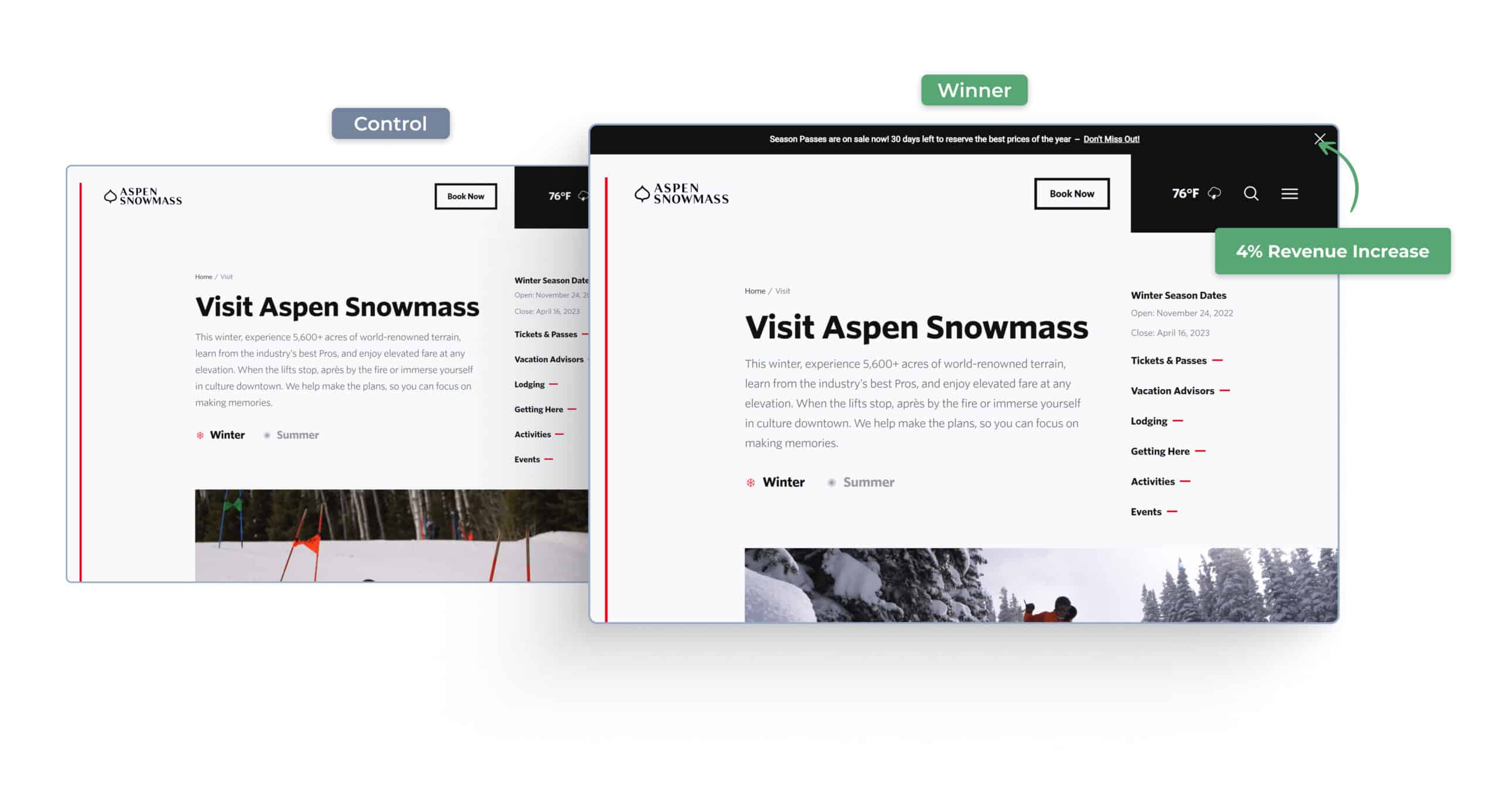
Based on what we learned from the test mentioned above, we added an urgency banner that called out how many days the best season pass price was available.
This test affirmed the previous learning about creating urgency for medium to high-intent guests, and the client saw results with
- Increased visits to the season pass page by 2%
- Increased overall revenue by 4%
Finally, we wanted to determine if urgency messaging would be beneficial at the end of the funnel.
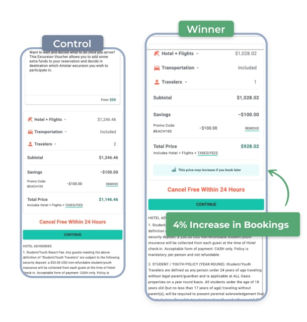
We added a simple callout next to the vacation price on the checkout details step of one of our OTA (Online Travel Agency) clients: “This price may increase if you book later.”
Just from that simple change, we observed
- a 7% lift in guests progressing to the payment step
- a 4% increase in bookings
These tests demonstrate the effectiveness of urgency messaging in various stages of the booking funnel. Whether it’s through countdown timers, urgency banners, or price callouts, creating a sense of urgency encourages action and improves conversion rates.
Where Confidence Becomes Key
Confidence messaging is a consistent home run for our clients. In two separate tests, we affirmed the value of leading a website with confidence messaging.
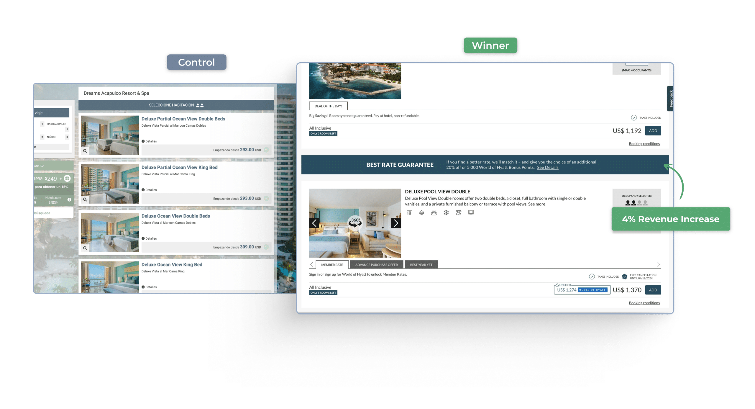
For a hospitality client with an extensive public membership program, we advertised their price match policy—$25 off or 5,000 additional membership points.
Just by adding that messaging into the funnel, our client saw:
- Increased continuations to the checkout step by 2%
- Increased bookings by 4%
We added this type of confidence messaging to the checkout step for an OTA that offered a similar discount if guests found a less expensive rate anywhere on the Internet.
After adding this message, our client’s booking increased by 3%.
The impact is clear: adding messaging to your website that tells guests, “You’re in the right place; you should book with us,” resonates and increases in-step continuations and booking conversions.
Why Placement Matters
You may ask yourself, “So if confidence and urgency messaging is good to add, should I add them everywhere on my website?” The answer to that is: It depends!
Really, it comes down to meeting the guest’s expectations. Imagine you’re interested in booking a trip but aren’t sure of the dates or destination yet. Is a message that says, “Going fast, book now!” going to sway you? Unlikely. This is why it’s pivotal to consider placement when adding urgency and confidence messaging.
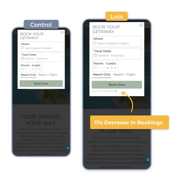
Don’t take my word for it. We tested placement of confidence messaging for the same hospitality client mentioned above. When the same messaging about their extensive public membership program was placed on their homepage, bookings decreased by 11% and distracted users.
We saw similar results for another OTA client when we added confidence messaging to their homepage, which resulted in an 8% decrease in bookings, especially for mobile traffic.
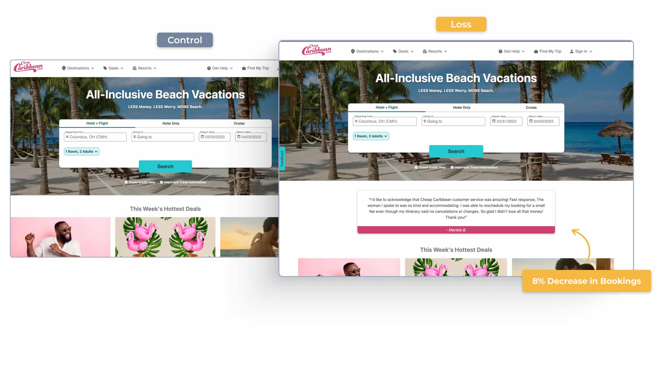
Confidence and urgency messaging are critical in enhancing user experience and driving conversions in the travel and hospitality industry. However, the effectiveness of these messages largely depends on their strategic placement and the context in which they are delivered.
While urgency messaging can push hesitant guests toward booking, confidence messaging reassures them they are making the right decision. The key is to tailor these messages based on where the guest is in their decision-making process.
Are you ready to get a better grasp on how your audience best responds to urgency and confidence messaging? Schedule your free strategy call today!

