Are you doing any of the following things on your website?
- Email capture pop-ups when the customer first lands on your home page
- Home pages that prioritize promotions or lead to dead-end searches
- More than one CTA on your product detail page
- Navigation or links within your checkout that allow the customer to navigate away
These are relics of a previous ecommerce generation, and they are likely creating unnecessary friction in the path to conversion. This article is the first in a two-part series that dives deep into four ways you can move your ecommerce experience forward and past your competition.
Tip #1: Avoid a Major Collision Between Marketing and Conversion
In ecommerce, starting the customer purchase workflow is the #1 goal. So why do retailers invest so much effort and real estate on marketing to new customers, at the expense of conversion? If the customer is on your site, consider them acquired, and make it quick and easy for them to convert. Don’t shower with them with ads or lifestyle imagery. Savvy shoppers are blind to them anyway. Every piece of content or feature on your homepage should be no more than one to two clicks away from add to cart.
Without fail, returning visitors convert at a higher rate than new visitors. That means after conversion and revenue, new vs. returning customer data is your most critical data point in building a conversion-optimized shopping experience.
If you have a high percentage of return customers, invest in making it easier for them to shop from your homepage. Too much focus on new customer acquisition could mean that you are making it harder for your loyal, higher value customer to complete their purchase.
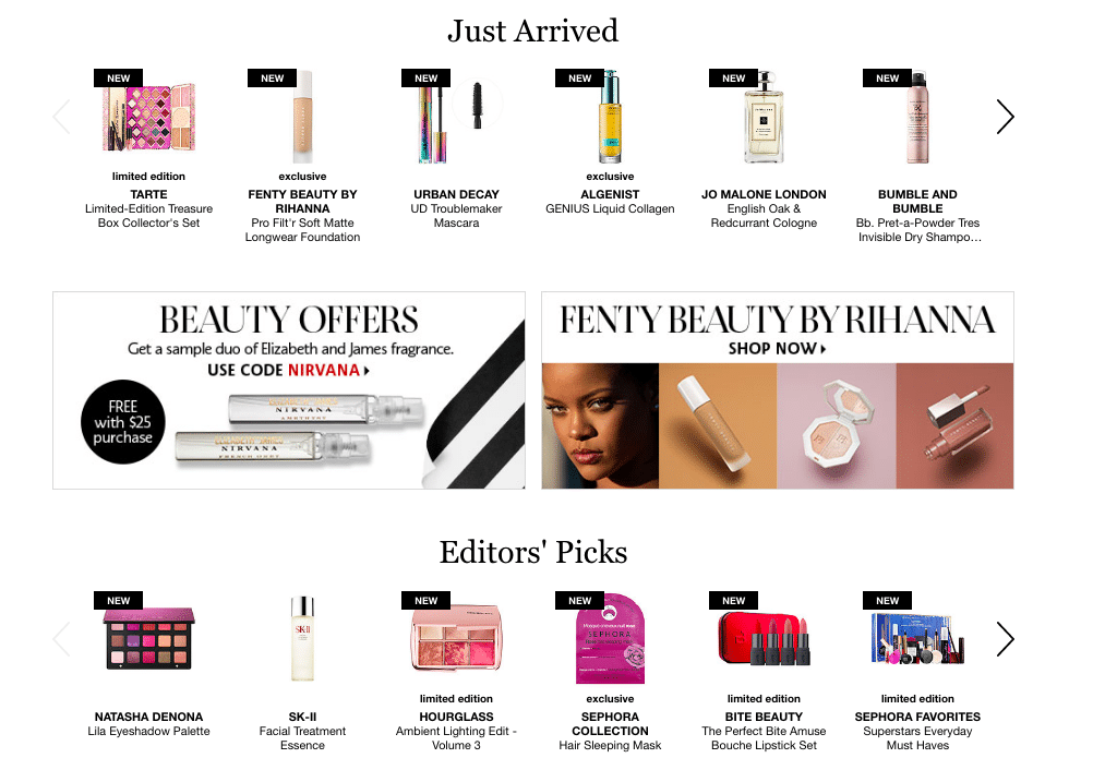
For example, Sephora.com streamlines the shopper experience, showing two small offers/promos on their homepage. Other than that, the whole homepage is dedicated to making it easier to shop with guided shopping features, including “recommended for you”, “editor’s picks” and “just arrived.”
Tip #2: Don’t Let Users Get Lost in Search
You may not have robust personalization that knows who your customer is and what they want when they land on your site, but I bet you can name the top 10 search terms for your site. You probably also know the most popular search facets and sorts on your site as well. You can use this data to get your customer one step closer to the item they want to purchase.
Try listing the top three to five searched items or brands on your homepage, and see what happens to overall page conversion. Not only are you saving your customer a search, those three to five items will likely perform better than a promo or lifestyle image in the same spot.
By far the worst search experience you can offer is a search that results in a dead-end. Most commerce platforms offer inline search suggestions that will direct a customer to a category or similar brand to help guide the search experience. They’ll also typically eliminate pages with no results (or “dead-ends”).
If your customer lands on a dead-end, add category entry points and recommendations on your dead-end page to keep your customer shopping. These features ensure that the site is always pointing the shopper in the right direction.
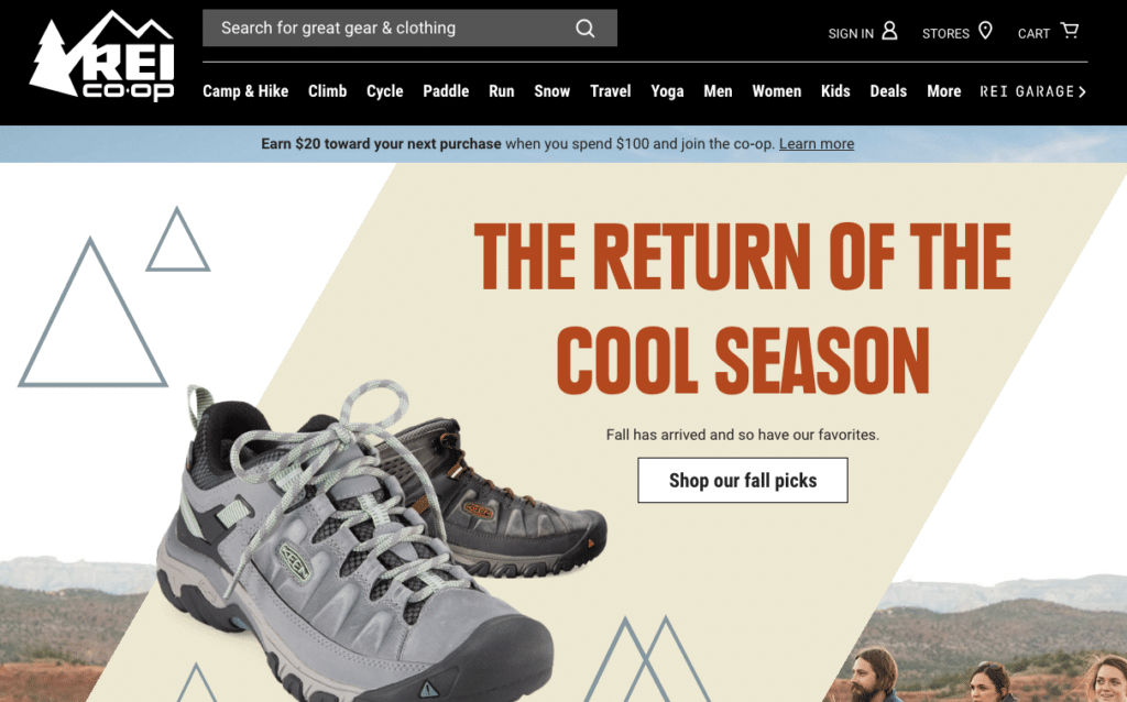
A good example of this is REI.com. They offer rich inline search features and top brands entry points from their home page, which reduces dead-ends and improves the shopping experience.

Stay tuned for the second installment in this series where we discuss two more ways to move your ecommerce experience forward by avoiding “Feature Fatigue” and “Funnel Failure.”
Ready to turn ambitious growth goals into deeper customer connections and measurable business impact?
Reach Out Today
