Insulated Beverage Containers
The business of insulated beverage containers is booming. If you are not drinking out of one while reading this post, you likely have one in your car or your backpack. The industry has grown significantly in the past 10 years, with old stalwarts like Stanley reinvesting in their brand to upstarts like YETI and Hydro Flask bringing a whole new perspective to the space by introducing lifestyle/social marketing as the cornerstone of their brand’s success.
These brands are built on selling their products wholesale, and they rely heavily on retailers like Amazon, REI and Target to market and sell their product, not their websites. This is why their websites have evolved into lifestyle first, ecommerce second experiences, and holes in the purchase funnel are a byproduct of this prioritization.
There is a huge opportunity for each of these retailers to optimize their sites for ecommerce without compromising their brand’s lifestyle goals, and a win for their bottom line.
While these brands battle for market share, we’ve done a deep dive on the purchase experience for each, and selected “winners” and “losers” for each key step of the funnel:
- Homepage
- Product Detail Page (PDP)
- Cart
The sites were reviewed on both desktop and mobile. Let the battle begin!
Homepage
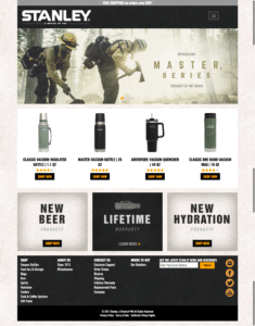
We can learn a lot from each of these brands’ homepage, including their customer persona: Hydro Flask is fun and outdoorsy; Stanley is classic and tough; and YETI is wild and for enthusiasts. All three make lifestyle branding their number one priority on the homepage (a good thing), but only one brand balances lifestyle messaging effectively with eCommerce on the homepage.
And the winner is… Stanley!

Both Stanley and YETI incorporate lifestyle imagery with clear “Shop Now” CTAs, but Stanley wins this round by also adding a popular products feature with direct links to the PDP (product detail page), reducing steps into the funnel by bypassing the category pages, while also surfacing product assortment in a predictable way for the shopper. This makes shopping easier, and can ultimately influence average order value (AOV).
Hydro Flask completely lost sight of the buy workflow on the homepage. The navigation is slick, but there are no “Shop” or “Buy” CTAs on the homepage, which is critical to getting people into the funnel.
Product Detail Page
This is the most important page in the funnel and where the purchase decision is made, especially if a shopper is purchasing this product for the first time.
Depending on the complexity and cost of the product, this page can make or break an experience.
For instance, YETI sells expensive coolers with many variations (sizes/volume) that solve different customer problems, unlike Stanley and Hydro Flask, which sell primarily food/beverage containers.
And the “best in show” is… Hydro Flask!

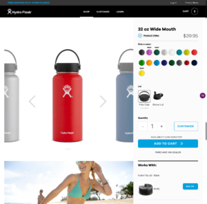
Great on mobile? Check. Easy to consume page? Check. Queue Fleetwood Mac, because Hydro Flask wins this one by a landslide. Not only do they offer large compelling product images and mobile-friendly CTAs, they integrate product customization and accessories seamlessly into the workflow. The biggest differentiator for Hydro Flask is not design (which is fantastic), but how they treat variations. They tout 183K unique variations, which they make extremely easy to buy.
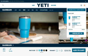
With the most expensive and complicated product assortment of the three, YETI’s PDP actually adds complexity to the decision process, rather than making it easier. There are PDP opportunities in both mobile and desktop, but the biggest opportunity is to create a seamless workflow from variation/size selection through to customization and purchase. YETI treats each of these tasks independently. Variation selection is either above the lifestyle image and not contextual to the “Add to Cart” button or on a preceding page, which makes it difficult to shop. Also, in desktop the “Add to Cart” button is below the fold and get’s lost below the lifestyle image. Generally, the focus on lifestyle and visual design elements makes it harder to shop.
Cart
We’ve run thousands of tests, and we consistently see retailers overlook the cart process.
In fact, it’s usually one of our first tests in a new client engagement. Cart experience starts when a shopper adds an item to cart, not when they’re taken to the Cart page. The best performing experiences offer an “added to cart” notification and/or surface a mini-cart in the top right, which allows the user to remain in the context of their shopping session. Once on the cart page, the best experiences have a single primary CTA, some sort of upsell/cross-sell feature and offer an “out” to continue shopping. The cart should also be optimized for mobile, as well as desktop, not both.
And the “best-optimized” cart goes to… YETI!

Stanley, we love y’all, but 2005 called and they want their cart back. First things first…on Stanley’s mobile site, “Cart” is hidden in the menu, adding an unnecessary step to checkout. Many tests we’ve run for clients have validated that the cart should always be in the top-level navigation. Once you’re in the cart, there are three primary CTAs, all with varying widths and distributed in different places on the page. One primary CTA in the checkout workflow is ideal, and it should always be in a predictable place on the page. Stanley does offer “spend more and receive shipping” messaging which is good way to increase average order value, but make it easy to do so by adding recommendations and/or accessories to the cart.
The original intent of this post was to crown a “winner” of ecommerce from the three brands. However, each of these retailers falls down in one key area of their ecommerce funnel.
Lifestyle/social marketing is critical to branding, but don’t let that distract you from losing sight of what’s important: making it easy to buy from you online.
[The recommendations in this article are a result of “gut-storming” and rely on our experience in optimization and ecommerce product leadership to evaluate the experience, rather than data. We recognize that every brand and every user is unique, and as such, all of these ideas should be fully tested before they are implemented.]

